I was a Senior Product Designer for the iOS, Android, and web applications, doing end-to-end UI and UX, user research and testing, and owning product strategy and vision, collaborating with a tight-knit squad consisting of a PM, an engineering lead, and a group of engineers.
I worked alongside the restaurant-facing teams and marketing teams to collaborate on features which would affect both B2B and B2C customers, helping Slice grow from Series A to Series C by enabling users who were loyal to a single pizzeria order faster and smarter.
The Challenge: Standing Out in a Crowd
Between well-funded startups like Postmates, GrubHub, Caviar, Doordash, and Seamless, users have dozens of options for ordering from the convenience of their phone or browser. The pizza space is even more crowded, with large chains like Dominos, Papa Johns, and Little Caesar's also having strong digital presences. Slice was founded to help independent pizzerias thrive against the competition, but besides a lower per-order fee for the restaurants, they offered nothing to consumers to set them apart from the pack outside of exclusivity. At the time, most users came to Slice through a Google search for a particular pizzeria, or were directly told by the pizzeria to order via our app leading to low adoption. The user experience reflected this in its simplicity, lacking even basic discover functionality—when I first came onto the team, the app was primitive enough that users had to know the name of the pizzeria they wanted to order from before they began.
The Solution: Build Beyond Feature Parity
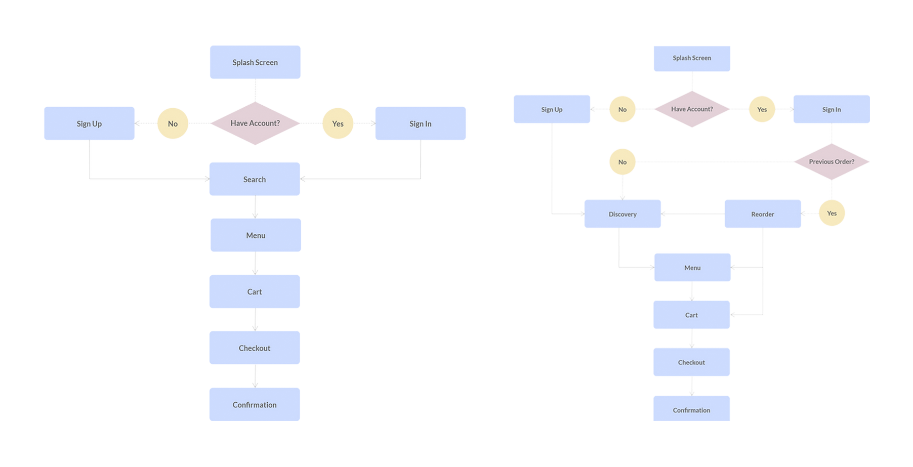
With experience working on the early mobile apps at GrubHub, I became the owner of the iOS and Android apps at Slice and led an overhaul to get the apps up to feature parity with the competition. This began with a competitive analysis to discover what users expected out of a first-class online ordering experience. For the highest impact on our user acquisition and conversion, we targeted the most glaring missing feature—discovery. To increase retention in our existing customers, we focused on the ability for return users to add their most recent order to their cart. These features were inserted into the existing app architecture to get basic parity with the competition. From there, I looked toward market differentiation.
Case Study
A Ground-Up Redesign
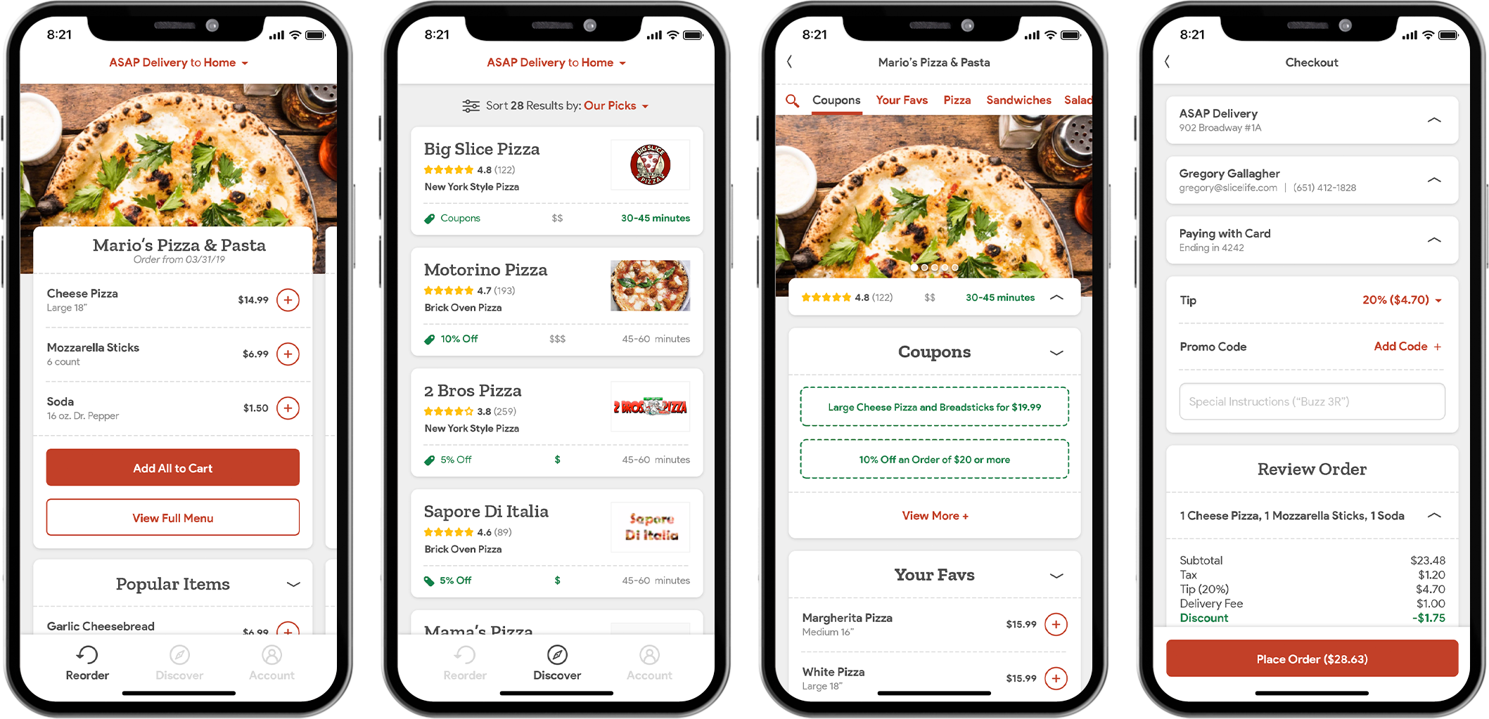
Redesigned screens for Reorder (Far Left), Discover (Center Left), Menu (Center Right), Checkout (Far Right)
With these updates, we saw a massive uptick in conversion for first-time users as well as retention for return users, and I began roadmap planning for the following quarter with the PM and engineering lead. We discussed dozens of features we wanted to implement—but the engineering lead expressed frustrations that the current app was built by a different team on an outdated framework. This meant that any new feature we wanted to implement would take far longer than if we were working on a modern framework. We brought in the CEO, CPO, and other stakeholders to discuss the problem and quickly got buy-in that with our current numbers significantly up, we could build a new version of the iOS and Android apps from the ground up. I would create an entirely new IA, UX, and UI, the engineering lead would develop the new iOS app himself, and our most experienced Android engineer would do the same. In a single quarter we were able to collaborate on the brand new, from-scratch architecture and go into the next quarter with two new lean apps which would allow us to move forward with a strong foundation. Over the following year we were able to focus on vast updates and improvements to the reorder experience, discovery, menu, checkout, and more.
The Personalized Homescreen
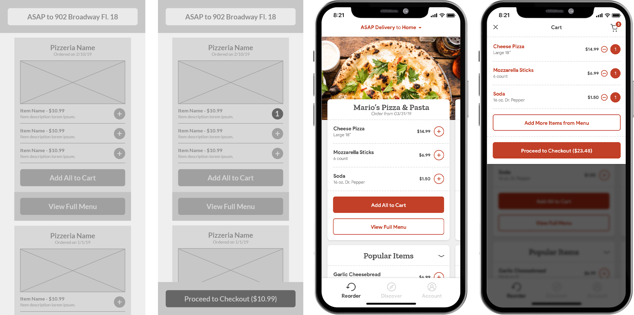
Reorder Wireframe (Far Left), Reorder Wireframe, Added (Center Left), Reorder (Center Right), Reorder, Added (Far Right)
In rebuilding the apps from scratch, we wanted to do it in as data-informed a way as possible. For the reorder experience, we based our updated version on three primary data points: that despite higher retention users actually spent more time ordering, that reorders tended to contain some of but not all of the user's most recent items, and that despite users generally being loyal to a single pizzeria, they tended to also order from a second pizzeria from a secondary location. I designed a new reorder experience that let users easily swap between different addresses, swipe between recent orders, and add individual items from their most recent order before jumping into the menu to explore new items. Over time, additional features were built such as suggestions of popular items, and the cart was brought into an overlay on the screen so users didn't have to jump between different screens in order to see what was in their cart so they could check out with fewer steps and fewer taps. This further increased retention with an added benefit of significantly reducing ordering time.
Differentiated Discovery
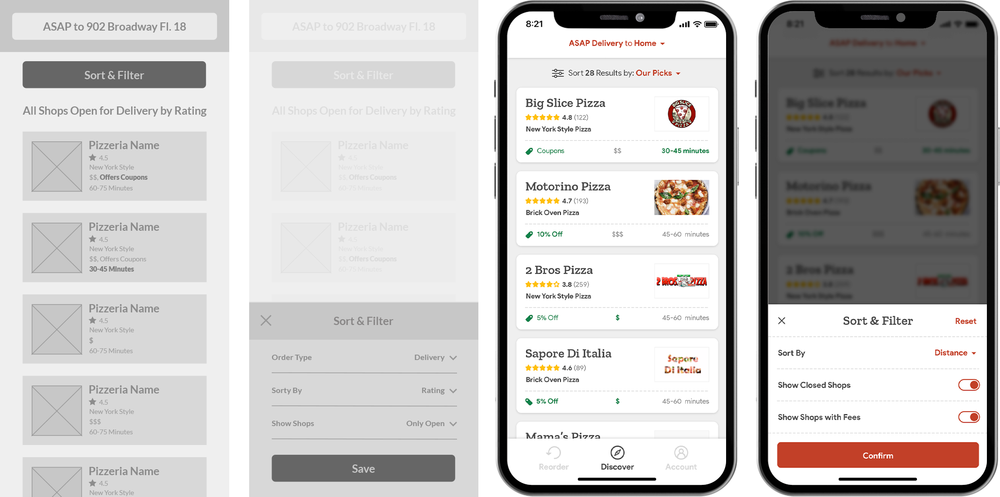
Discover Wireframe (Far Left), Discover Wireframe, Filter (Center Left), Discover (Center Right), Reorder, Filter (Far Right)
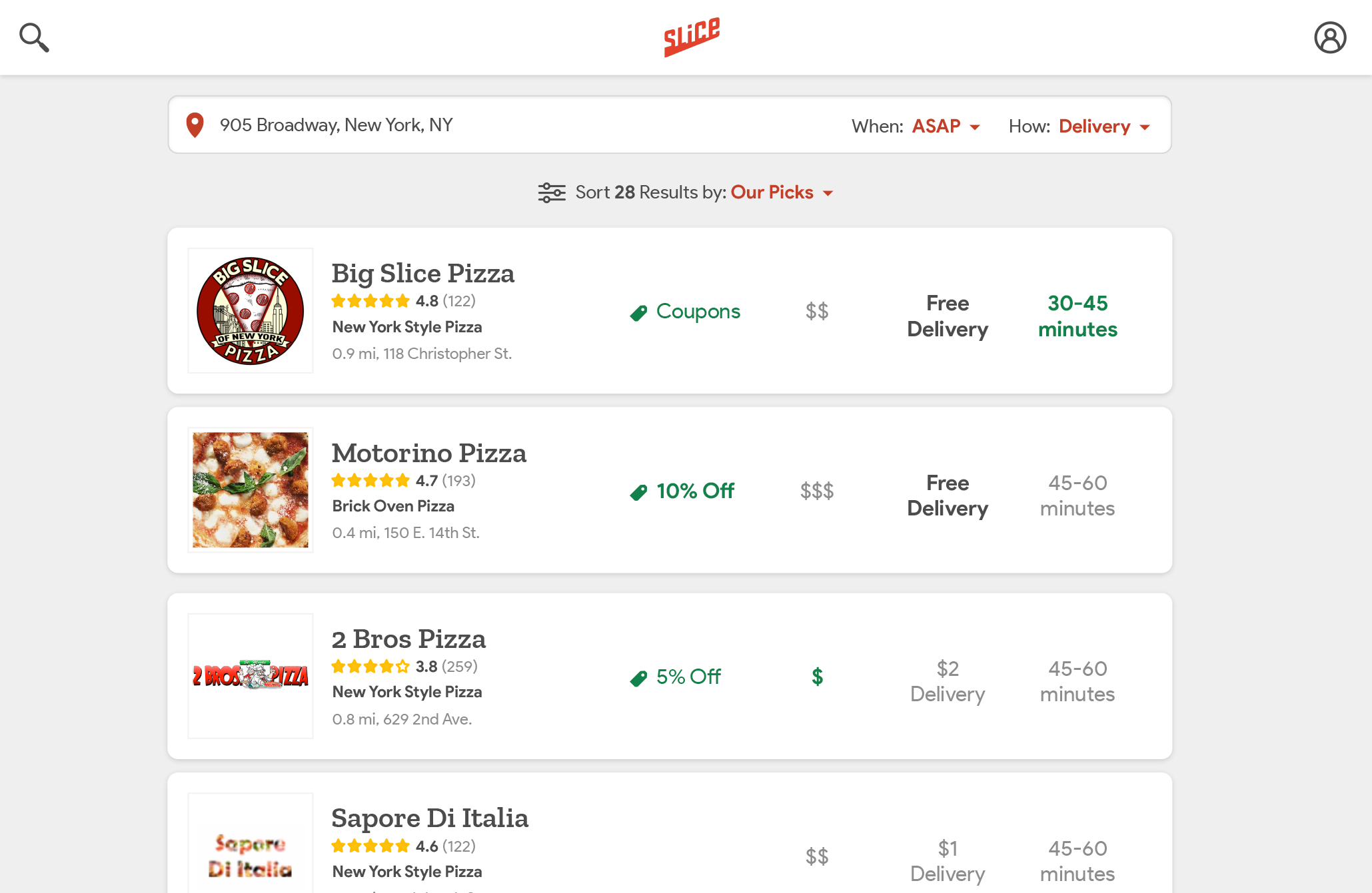
The initial version of discovery was extremely basic, displaying the pizzeria name, logo, and address. Unlike our competitors who were able to differentiate restaurants on their platforms through star-rating and cuisine type, the menus of most pizzerias are extremely similar and due to loyal customers, their star ratings tended to all be fairly high. This made it so that first-time users without a pizzeria in mind had to pick between pizzerias based on very little information. In the app redesign, I wanted to focus on what elements at each shop made it different from the others in the area despite our limited data from shops. We began with "The Pizza Taxonomy Project" where our account associates and data entry people categorized pizzerias into broad groups like "New York Style" and "Brick Oven Pizza" and "Italian Restaurant" to help users understand what sort of pizza to expect. Next, I looked at our data and sent out user surveys to understand what drove our customers when searching for a new shop. This data led to the creation of three personas: the Coupons user, the Overall Value user, and the Want It Now user who were driven by deals, low prices, and delivery time respectively. In the new search results, I then highlighted if a shop had a more attractive offering in one of these areas than the other pizzerias in the area. Finally, I added in the star ratings to the search results to help give users confidence in the quality of the pizzeria they were ordering from, even if most were highly rated.
Streamlining Checkout
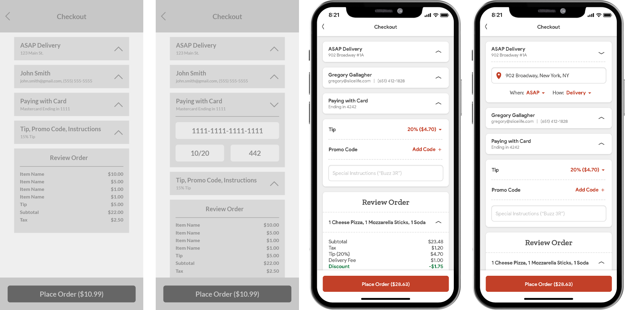
Checkout Wireframe (Far Left), Checkout Wireframe, Edit (Center Left), Checkout (Center Right), Checkout, Edit (Far Right)
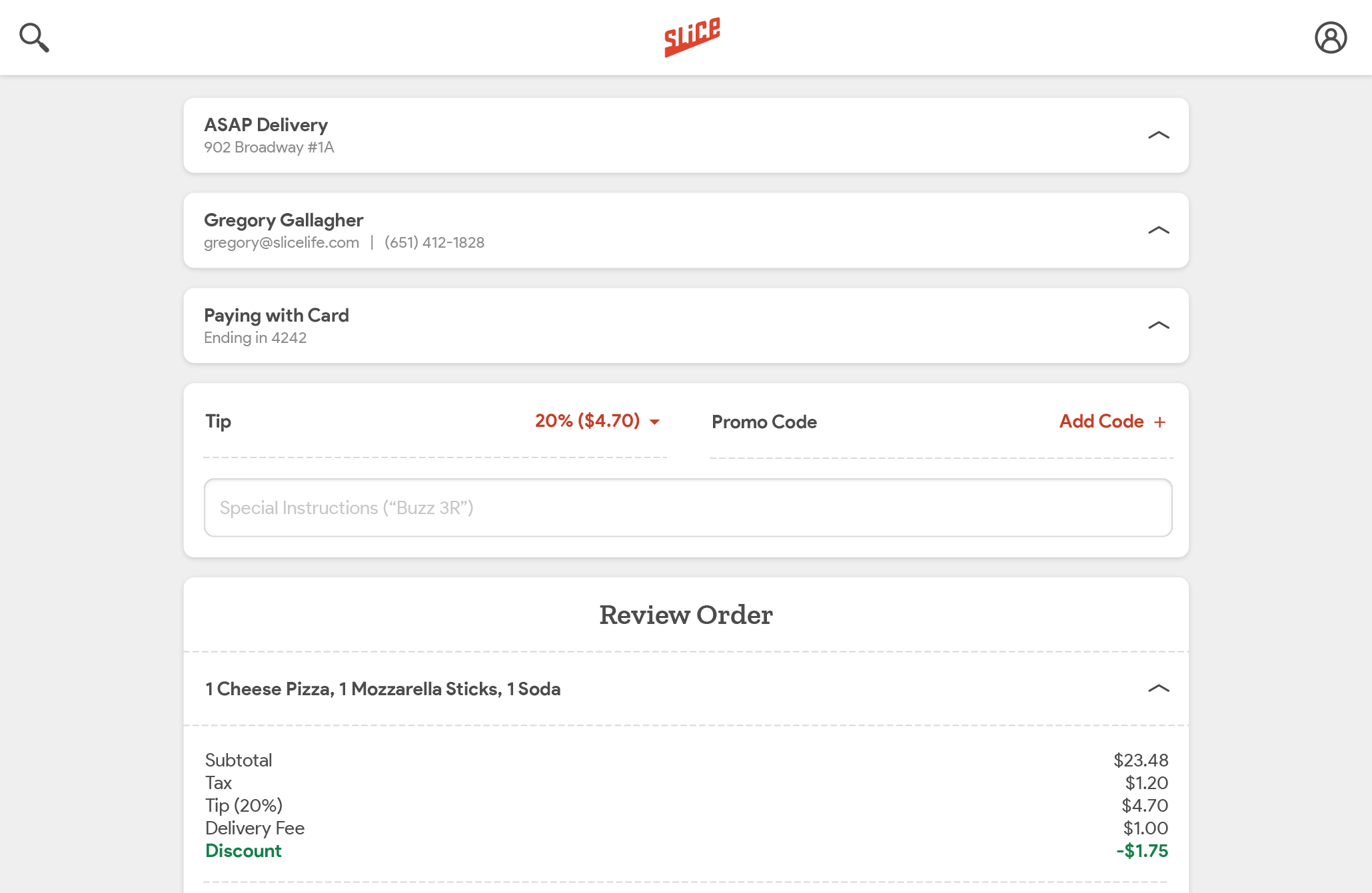
Looking at our funnel was a huge part of the product strategy for the resdesign. We found that checkout was by far the biggest opportunity to fix dropoff and get users who had already committed to an order over the finish line. The initial version of checkout was clunky and put nearly 20 fields in front of the user which they had to fill out or scroll past every time they used the app, whether or not they had filled the field out on a previous session. I broke the checkout down in to smaller, manageable sections which would be auto-collapsed if the information within didn't tend to change from order to order. The initial concept contained a collapsed version of tip, promo code, and instructions, but after extensive usertesting and A/B testing, we determined that even though these fields rarely changed between orders, users still wanted to have the reassurance that they were easily accessible. In addition, I collapsed the items from the review order module into an accordion with a preview.
Closing the Loop
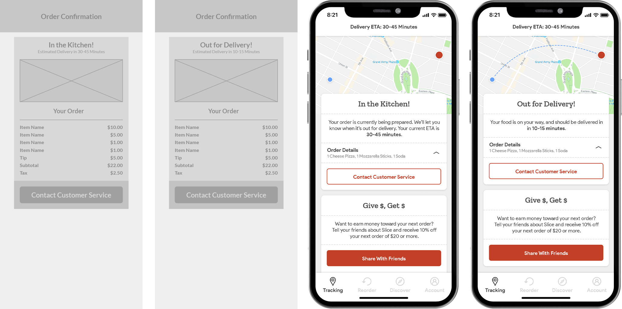
Tracking Wireframe (Far Left), Tracking Confirmed Wireframe (Center Left), Tracking (Center Right), Tracking Confirmed (Far Right)
The final piece of the puzzle for iOS and Android was closing the order loop once the user had gone through checkout. In the old experience, users were given a one-time confirmation screen which told them that their order had been received, but didn't give them any next steps and disappeared as soon as the user closed the app. Users had given us feedback in our post-order surveys and interviews that they often felt lost and unsure of the status of their order, as when they opened their app after the initial confirmation there was nothing to indicate that their order was in progress. We wanted to give them an experience that would allow them to feel secure, despite our order tracking and in-kitchen tablets still being in their nascent stages. Without the ability to give real-time tracking information or a true ETA, I made an experience which evoked that information to give the user that feeling of security as well as a place to open their app and check on their delivery. As our B2B services continued to give us additional data into order status, time, and tracking, this would evolve and continue to give real-time updates to the user's order information.
User Testing
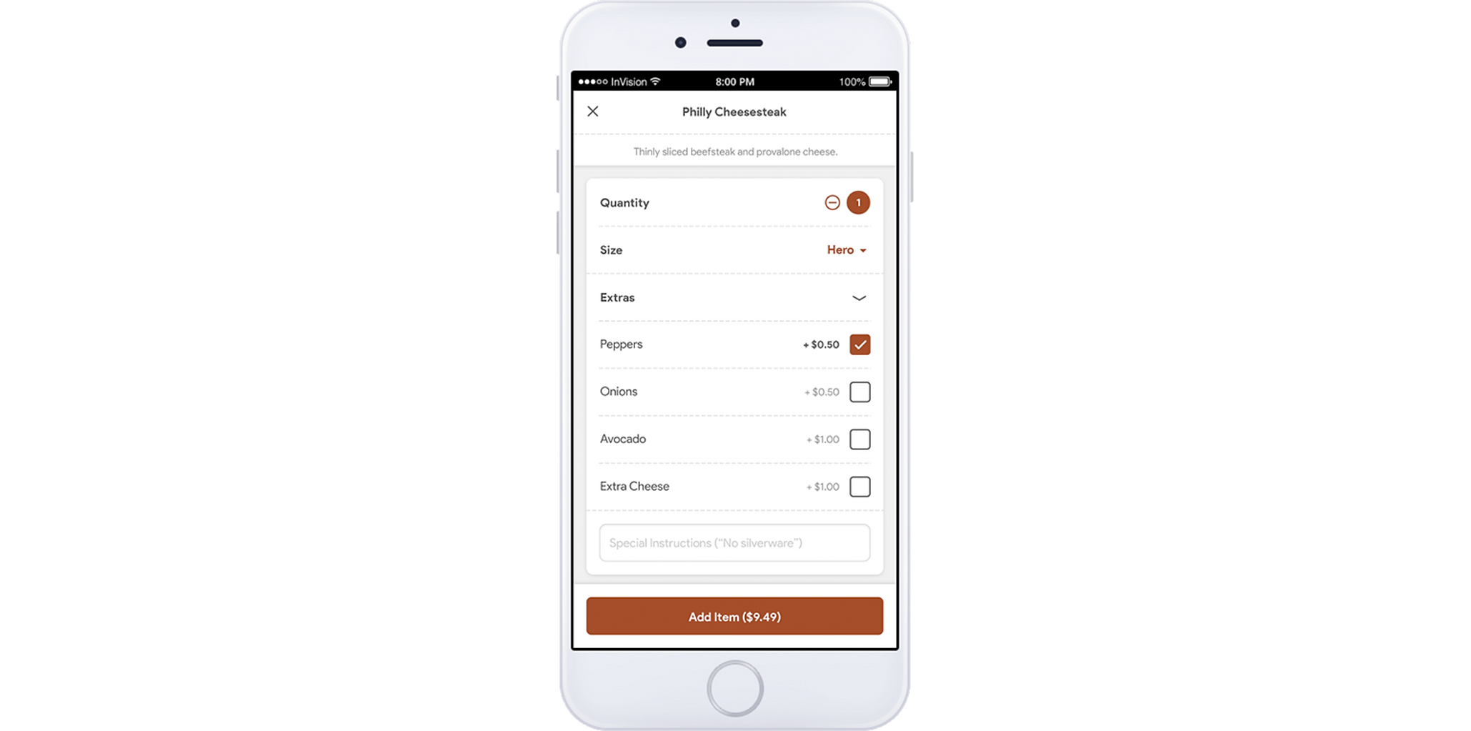
InVision Prototype
Throughout this process, I relied heavily on post-order surveys to gather qualitative information from users, as well as conducting extensive user testing, user interviews, and A/B tests for each feature, as well as interfacing directly with our data team and working with the PM to consult our internal dashboards. On our mobile apps we had a limited ability to view real-time user sessions, but with a restructure to split the teams up in order to focus on B2B tools, the mobile team became the consumer team and I moved to owning the entire consumer-facing mobile and web experience. At this point, we integrated FullStory to watch real-time user sessions on the web and gain valuable insight across the products.
Bringing the Web to Parity
Search results on the web
As the B2B side of Slice continued to grow, the teams split up into a restaurant team which owned B2B products, an internal-facing tools team, and the consumer team which I owned. With the app redesign out in the world and constant iteration improving the new features, the focus became getting the web up to parity and I worked to roll out the new features from the updated mobile app across our mobile and desktop web experience, bringing it to relative parity over time.
The End-to-End Experience
Checkout on the web
A walkthrough of the full Slice experience is available upon request.


