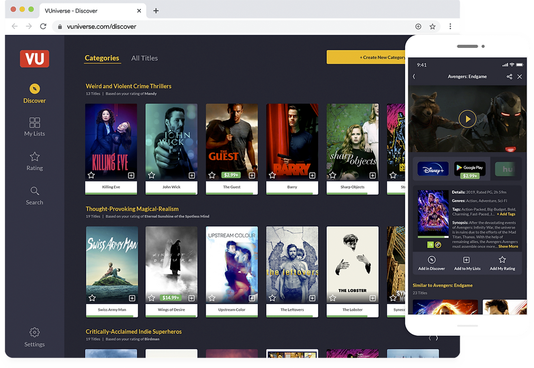

I was brought into VUniverse at the seed stage to envision, define, and design a mobile and desktop application that would solve the tyranny of choice in an increasingly-fractured streaming service environment. With a small bootstrapped team I crafted a simple and robust solution using personalized recommendations, smart user-generated content, and robust customization controls.
“Know What to Watch”
The Challenge: Tyranny of Choice
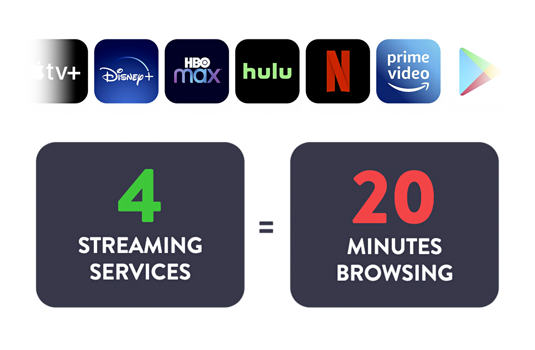
Consumers have access to an average of 4 streaming services and thousands of titles to choose from. With relatively shallow recommendations and poor sorting and filtering controls on the streaming apps themselves, users are often left frustrated, wasting an average of 20 minutes of browsing per session.
The Solution: The Best of All Worlds
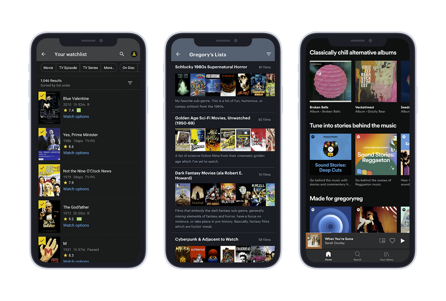
Taking inspiration from the best aspects of Letterboxd, IMDB, Spotify and the streaming apps themselves, my solution brought together a seamless content discovery experience, engaging yet light social features, and robust customization controls that put the power back in the hands of the user.
Case Study
User Personas
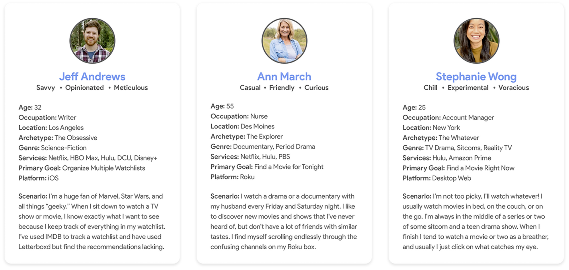
Based on the demographic breakdowns of major streaming providers from industry sources as well as research into the user bases of similar and adjacent services, I crafted three user personas for VUniverse: The Obsessive, representing the 18-35 male demographic who would was less interested in discovery than creating lists and categorizing titles and would be our early-adopter user set, The Explorer, representing the 45-65+ demographic of casual users who were focused on getting specific recommendations to their tastes, and The Whatever, a demographic of young, voracious viewers who wanted lots of recommendations for lots of genres. These personas helped to drive decisions about which features to focus on for the beta launch and beyond to create eager product advocates who would use the service while we were still in our nascent stages and adding features.
User Flow
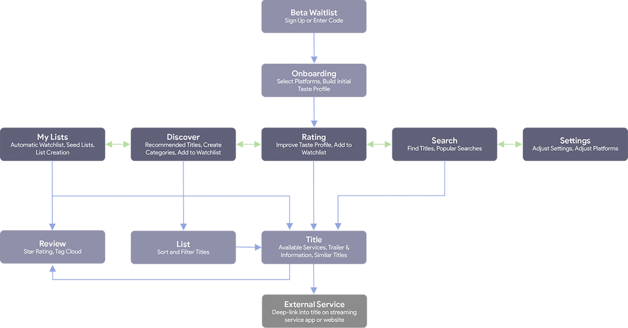
A flow diagramming the major touchpoints and user paths
Based on the user personas, research into competitors and other adjacent discovery platforms, conversations with the founders about product goals, and conversations with the CTO about the planned backend, I created a user flow and high-level information architecture plan for the product. We would begin with a waitlist in order to build up a significant user base for our alpha and eventual beta launch. After users sign up for the the waitlist and receive their access code, they would go through the onboarding process where they would select their streaming platforms and build their taste profile. Once we had enough information to serve recommendations, the user would be given access to the full app, including rating, list building, discovery, and search. The goal would be to drive them to add titles to their waitlist in order to get them to a title of their choice, then deep-link them directly into that service.
Wireframes
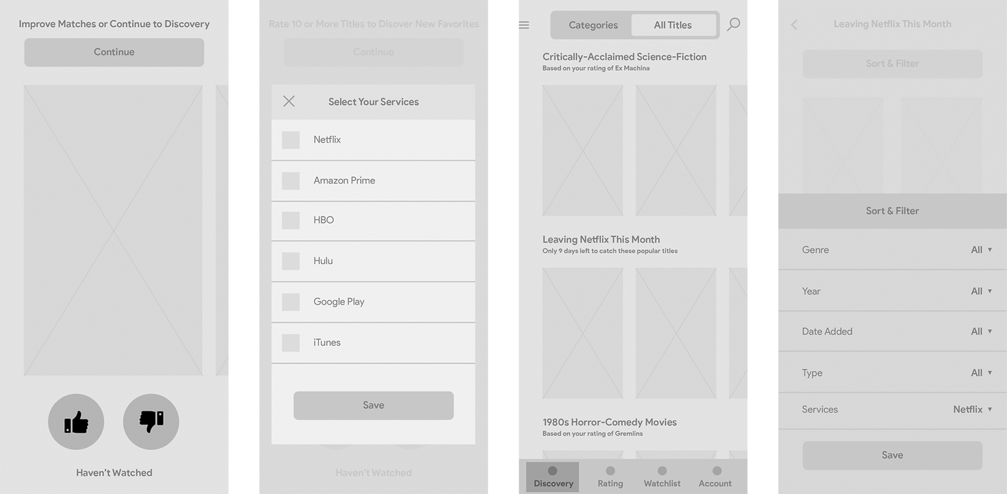
A selection of early high-level wireframes
With the high-level information architecture signed off on by the CTO and the back end work beginning on the engineering side, I began to flesh out the user flows into wireframes which could convey the full functionality of each screen and function to the stakeholders for approval and serve as a basis for the front end engineers to begin planning their work on iOS and Android as our two lead platforms—with a responsive web version of the app to follow. The process for the onboarding flow and discovery would be key to the experience and much of the focus for the early wireframing would go into making sure that the functionality of each screen matched our user needs. These wireframes were discussed in depth with the CTO and engineering team to make sure that the complexity of the platform being designed matched our capabilities of what features we would be able to build during our alpha launch frame.
Prototyping
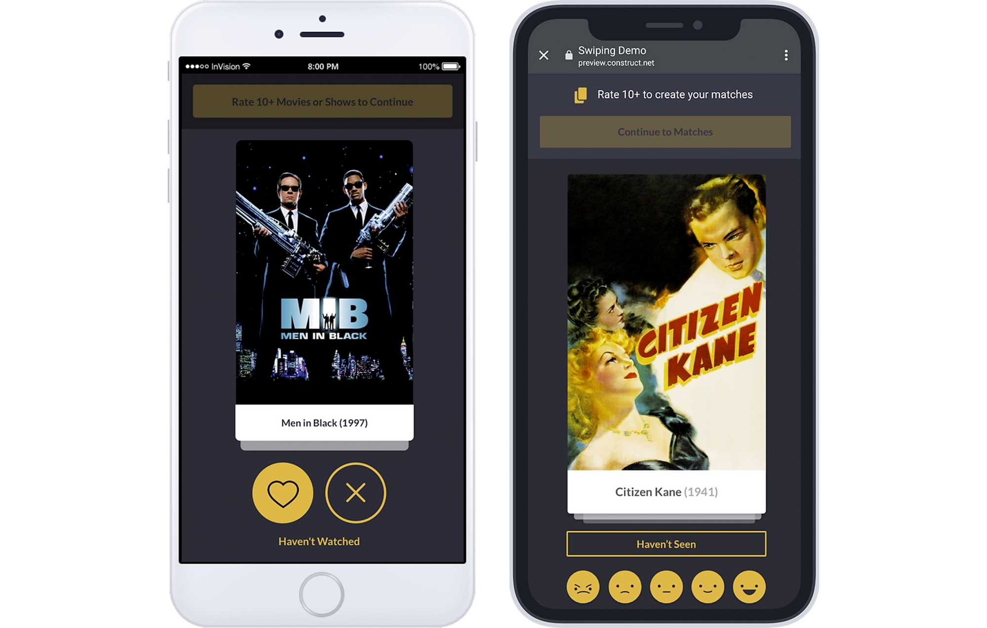
Early “Swiping” Prototype (Left), Later “Rating“ Prototype (Right)
With the wireframes approved by the stakeholders and handed over to the development team, I began to build prototypes to validate many of the assumptions that went into the fleshing-out of the basic screens. Several onboarding prototypes were created to make sure that the experience struck a perfect balance between getting the amount of information we needed to build the users' taste profiles while not taking so long that users would abandon before they got to their recommendations. The first version was created in InVision as a low-fidelity prototype to test the binary swiping mechanic amongst the stakeholders. While it conveyed the experience well, it was determined that we would be able to get a significantly more robust data set from users who provided a more granular rating. As 1-5 star rating systems tended to result in users either giving a 1 or a 5 star rating, we tried multiple variations on rating systems before ultimately landing on a star rating system based on user feedback.
Recommendations
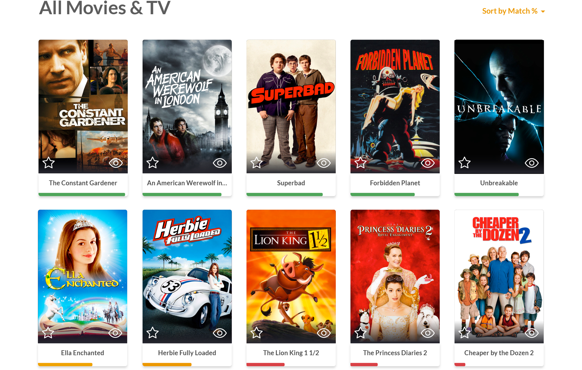
A spectrum of “percentage bar” recommendation score displays
VUniverse was powered by an AI-based learning algorithm built on top of a complex web of nodes from information provided by our data providers. This algorithm would serve smart, granular lists of movies and TV shows which corresponded to a user's taste profile—specifically recommending titles which they gave a high rating to, either during onboarding or during browsing. Going well beyond the high-level list of genres provided by the streaming services themselves, these lists would be able to account for mood, critical rating, subgenre, and even thematic connections between films. The algorithm would get smarter over time using information provided by our users, from their taste profiles to the lists that they created to "reviews" in the form of pre-written tags from a word cloud. Each time a user-generated list was created and matched the taste profile of another user, that list would also be floated to the top of similar users profiles, then customized by sorting the list based on previously watched titles, differences in taste profiles, and selected streaming services. In addition, lists were generated for titles which were arriving on or leaving streaming services every month, ensuring that users had new content every time they came back as our algorithm deepened its understanding of movie and TV connections.
User Testing
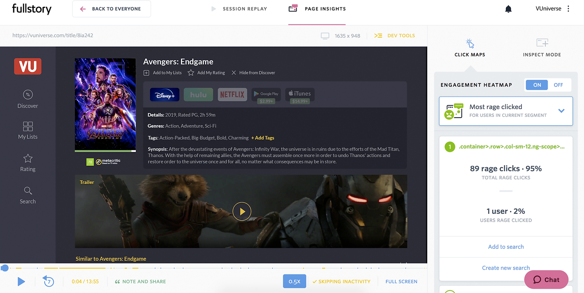
FullStory was one of several platforms utilized for user testing
After the alpha launched, I worked closely with the marketing team to create an email user survey to get qualitative feedback from our early users about their experience. Through that survey I collected email addresses of users who were interested in doing incentivized user interviews, at which point I used usertesing.com to have them walk me through user sessions and give real-time feedback about their experience, as well as extending these sessions to non-users to understand how those outside of our primary demographic reacted to the product. During this time FullStory, a passive session recording software that gives a view into real-time user interactions, was integrated into the product and gave insights into frustrations the users had with the platform, leading to tweaks, updates, and changes to the core user experience to make the app and web experience more intuitive.
Beta Launch
Launched a closed beta in January 2020
VUniverse became a SXSW 2020 Finalist in Innovation for its recommendation algorithm and smooth user experience, and planned an open beta launch in tandem with SXSW 2020. With a premiere set for the festival to get the beta in the hands of real-world users and fervent film fans in our primary demographic, VUniverse was pushed out to final beta in late spring. When SXSW was canceled due to the COVID-19 pandemic, VUniverse closed its doors due to industry-wide changes in funding.
A walkthrough of the full VUniverse experience is available upon request.

